Overview.
Pringles Redesign Project
Embarking on this mock project to reimagine the website from my perspective was truly exciting. It allowed me to apply my creativity and ideas to the process. Pringles has widespread popularity and a strong brand identity including its easily recognizable logo and distinctive snack cans.
Doing Pringles not only inspired me due to its widespread popularity but also because of its strong brand identity. The logo is instantly recognizable along with its distinctive snack can.
Embarking on this mock project to reimagine the website from my perspective was truly exciting, allowing me to apply my creativity and ideas to the process.
The Challenge.
It was crucial to maintain the brand’s identity and make the website across all age groups.
It was also important to preserve the excitement and fun essence that defines the brand.
The Challenge.
It was crucial to maintain the brand’s identity and make the website across all age groups.
It was also important to preserve the excitement and fun essence that defines the brand.
The Challenge.
It was crucial to maintain the brand’s identity and make the website
across all age groups. It was also important to preserve the
excitement and fun essence
that defines the brand.
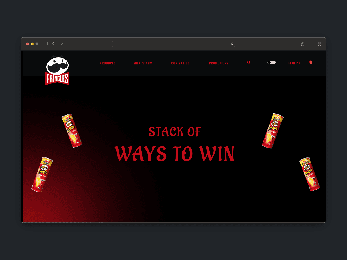
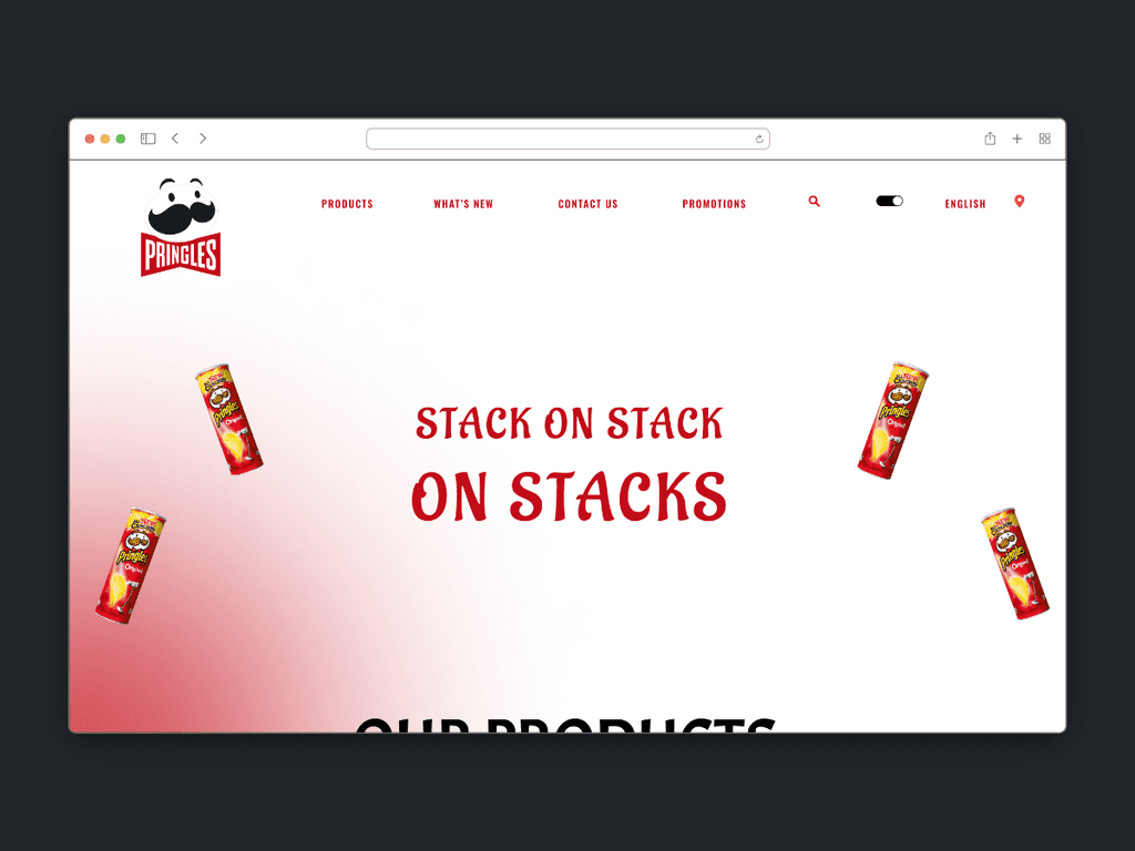
The Solution.
To maintain the identity of the brand it is required to include a similar font and colour pallet. Aligning with the logo's black and white scheme, the website's theme establishes familiarity and enhances user-friendliness. Additionally, interactive elements across the website were key in bringing out the brand's fun aspect, ensuring the user experience as they navigate through the pages.
Oswald Family
abcdefghijklmnopqrstuvwxyz
ABCDEFGHIJKLMNOPQRSTUVWXYZ
1234567890
Oswald Family
abcdefghijklmnopqrstuvwxyz
ABCDEFGHIJKLMNOPQRSTUVWXYZ
1234567890
Libre Franklin Family
abcdefghijklmnopqrstuvwxyz
ABCDEFGHIJKLMNOPQRSTUVWXYZ
1234567890
Libre Franklin Family
abcdefghijklmnopqrstuvwxyz
ABCDEFGHIJKLMNOPQRSTUVWXYZ
1234567890
Aladin
abcdefghijklmnopqrstuvwxyz
ABCDEFGHIJKLMNOPQRSTUVWXYZ
1234567890
Aladin
abcdefghijklmnopqrstuvwxyz
ABCDEFGHIJKLMNOPQRSTUVWXYZ
1234567890
Aa
HEX #000000
Colour Pallet
Colour Pallet
Aa
HEX #000000
Colour Pallet
Aa
HEX #000000